


I created a fictional restaurant inspired by a few of my favorite restaurants combined and favorite cuisine, Italian.
I knew what I wanted the aesthetic to feel like but had a hard time articulating it and putting it down on paper. I wanted the brand to have a lot of color and fun design elements since I knew I wanted a “create your own” option. Additionally, I am a big fan of Vincent Van Gogh’s work and wanted to integrate his style into my restaurant. I hit a snag when I remembered that Van Gogh was Dutch and I couldn’t make it a completely Italian restaurant. After naming my restaurant Van Dough, it transformed into an artisanal kitchen so i could keep many of the Italian dishes while practicing old cooking techniques. This made a lot of sense because my favorite style of pizza is Neapolitan meaning thin-crust, 00 flour, hand kneaded and formed, and made in a wood fired oven at 485 degrees.
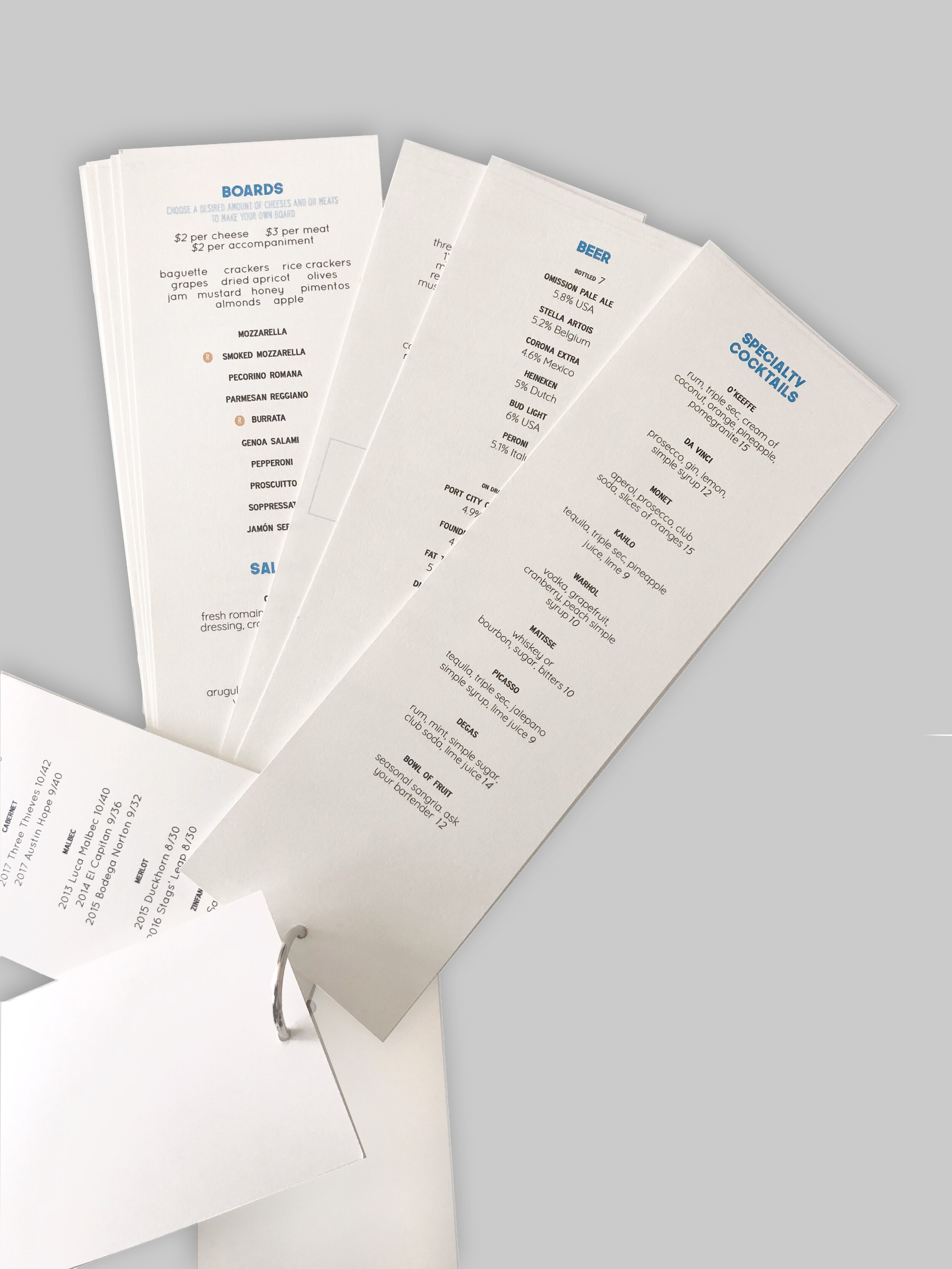
I first compiled a list of dishes I wanted to have on my menu, then I played around with the layout and spent time thinking about the logo and visual presentation.
The next step was the logo. I spent quite a bit of time refining it and figuring out if I wanted an icon or something short to abbreviate it to. I decided it looked best as a full name and started adding some Van Gogh like strokes to letters. When I looked back on it a few months after, I felt that the logo wasn’t popping so I modified it. Since the majority of food offered tends to be heavy, I mimicked that feeling with the letters by filling in the counter spaces.
The first go had a large menu and a smaller fanned bar menu. When I revisited the project, I liked the smaller menu more and felt like it was more creative and fit the space since it was modeled after a paint sample book that fans out. Overall, I am happy I revisited it and created more deliverables.